The color looked as if it was pulled from a Christmas tree ornament, the deepest shade of candy apple red you’ve ever seen. It simply glowed beneath the parking lot lights, perfectly complementing the Miata’s lines.
So, of course, I had to ask the owners: Was the paint custom or something from another model?
It was a wrap.
Even while standing 2 feet away from the car, I had no idea. No stretch marks. No creases. No runs, no drips, no errors. The finish looked flawless. Opening the trunk or doors didn’t kill the illusion; conveniently, the car was originally painted red.
Today’s wraps have transformed how we adorn our cars–both for the road and track. We’ve written about the process and have wrapped a few project cars in the past. The results have been stunning. Crisp. Neat. Everything brought together as a cohesive look.
[How to wrap your race car at home | Project LS-Swapped 350Z]
We’ve come a long way in decorating our race cars. Hand-painted signage yielded to die-cut vinyl to today’s wraps. And today’s race cars look just gorgeous, as anything’s possible. You want to put your dog’s face on the hood? Change liveries for every race? Use all the colors of the rainbow?
But have we lost some of the charm from years past? Was there anything wrong with the meatballs of the ’50s and ’60s? What about the Western fonts of the ’70s or the bold, diagonal stripes of the ’80s?
Has the standardization of number panels sanitized sports car racing? Do today’s race cars lack the empty space that made things more dramatic?
There’s a reason why I run meatballs on my Miata–big and bold, just like they did back in the day. (Side note: 17-inch-tall meatballs work well on an NA.)
[Meatballs for our Miata | Garage Rescue Miata]
Picture an iconic race car, and there’s a good chance it comes from an era before wraps and computer-designed graphics, whether it’s the Brumos Porsche 911 and BRE Datsuns or the factory Audis and Shelbys. Some more fan faves from the past: Penske Camaros, Dale’s Goodwrench Chevys, and anything backed by Gulf, Martini or John Player. Even without photos, you can picture them, right?
You can argue that the infiltration of sponsorship dollars into the sport in the 1970s changed the look of race cars. The international colors and simple schemes of the past were quickly replaced with corporate logos.
But somewhere in there was a middle ground that just worked. Example: the Budweiser DeKon Monza originally fielded by Interscope Racing for Danny Ongais in 1977, although the beer backing came when Jim Adam drove the car in 1980 and 1981.
The look–and yes, I grabbed the rendering from the RaceRoom Racing Experience sim because my pics of the car weren’t nearly that dramatic–comes across as bold and simple. Bright red with just the sponsor running down the doors and onto the front fender. No secondary logos.
The number, right there aft of the rear wheel, would never fly today. A simple pinstripe frames everything. It’s all perfect–and that’s before we discuss the merits of box flares, side pipes, and three-piece wheels nearly as wide as they are tall.
I know we can’t put the genie back in the bottle–and the work of today’s motorsports graphic artists can look just stunning–but maybe occasionally we can take a look back.
Can we bring back strobe stripes? Flat black hoods? Groovy fonts for numbers? How about just the classic IMSA and SCCA logos?
Maybe we could arrange a compromise, and I admit that I totally stole this from J.G.: How about some throwback events?
[Vintage Liveries on Modern Cars]
NASCAR does it: big, bold logos and simple graphics from the days of chrome bumpers and mesh-back, foam-front hats worn unironically.
What if IMSA teams ran old-school liveries for Daytona or Sebring? Ford did it with its GT program back in 2019. Could we get more members of the class on board?
I’ll pack extra film for that one.
Comments
OK, since you seem to be stuck in the 70s I'll try my best to keep you happy. Current plan for my '72 Corolla Challenge car ( if I ever get the darned thing finished) is "tool box" red ($10/gallon), white meatballs on the hood, trunk, and doors with black numbers. Since the car has a black fiberglass power bulge hood anyway, that will likely be flat black. Wide silver wheels, covered by some sort of 5" wide flares to complete the look. Maybe some white stripes along the lines of the Boss 302 Trans-Am Mustangs. I expect pictures in the magazine since you seem to have some pull around there.
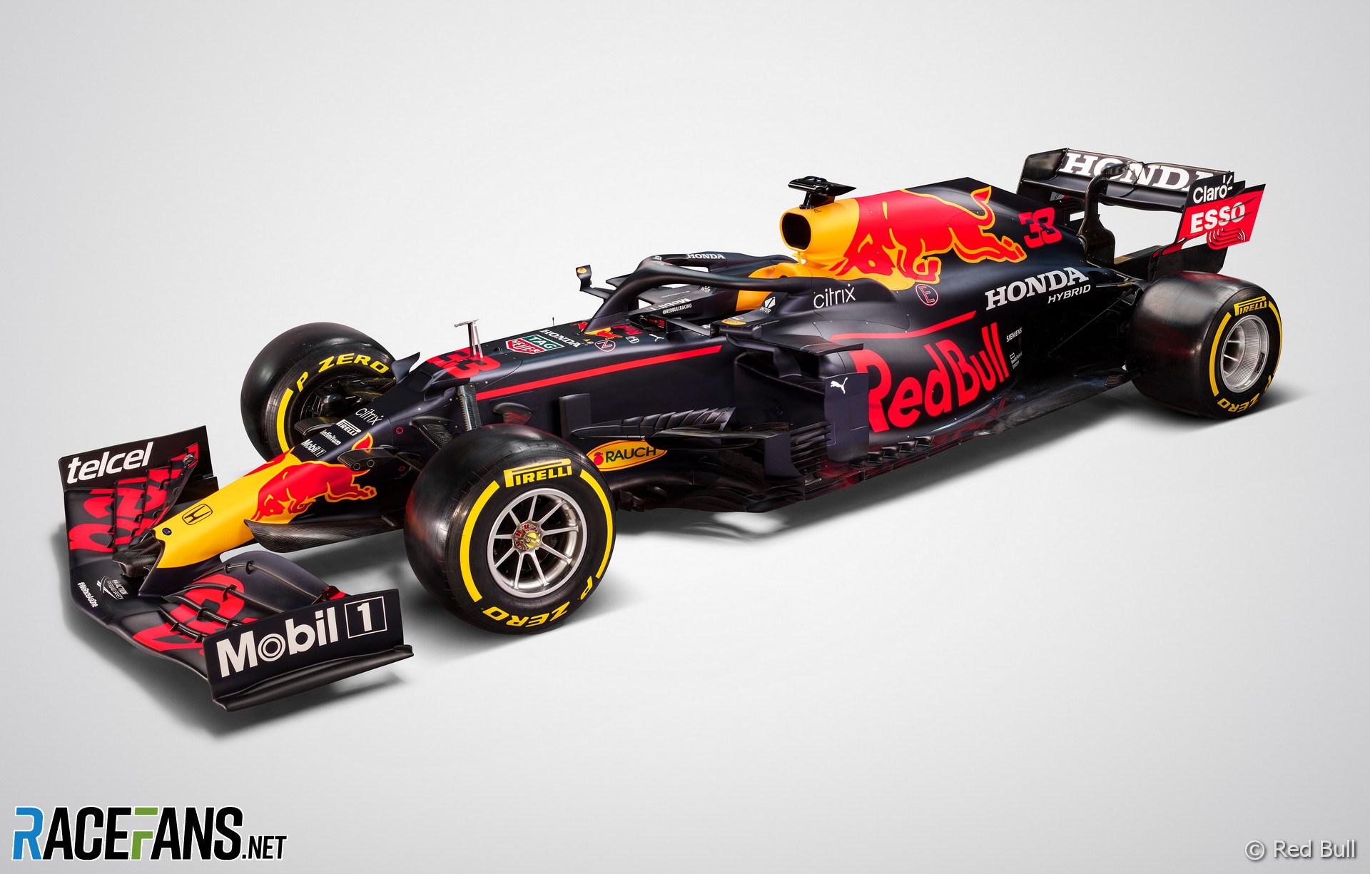
It is 100% the fault of wraps. It's so easy to drape a complex design over a car that that's all the designers do. Red Bull in particular is a frequent offender. Come up with something that looks good in a render and forget that it will fail to pop at speed.
Also - it's harder to do a graphically strong simple livery than a complex one from a design standpoint, and that's especically true with modern tools and wraps. With paint, it's the exact opposite - the medium rewards simplicity, which means you lean towards big bold statements in distinct colors.
People are invariably surprised when they find out the stripes on my car are paint.
Ironically, the first time I put numbers on a race car it was on a standardized panel that had GRASSROOTS MOTORSPORTS printed along the top :)
In reply to Keith Tanner :
You weren't the only one with a GRM panel on a Miata (circa 2006).....
In reply to Keith Tanner :
Red Bull just needs to de-clutter their designs a bit. Like so................

Duke
MegaDork
1/3/22 11:14 a.m.
In reply to David S. Wallens :
THANK YOU. I hate the overly complex "dazzle camo" schemes that became popular in the early-Oughties. They complete eradicate the lines of the car and, worse, they usually distract from the very point of brand identification.
j_tso
HalfDork
1/3/22 11:32 a.m.
I'm sure they were simple back then because the car would otherwise spend too much time in the paint shop. Tape and spray some stripes quickly so the team can get back to testing.
Red Bull's livery may be complex, but the cartoon bull on the side makes their cars easy to spot.
In reply to j_tso :
Also, back in the old days, ads on race cars started out as a way for teams to recoup some costs (John Player Lotus). Now racing is almost completely subsidized by advertising above the club level, and even to some extent at the club level. Race cars are just another advertisement, and Red Bull wants to be 1000% sure whoever is flipping through the channels past a race sees their logo.
DeadSkunk (Warren) said:
In reply to Keith Tanner :
Red Bull just needs to de-clutter their designs a bit. Like so................
Ironically, they have really solid design on their cans. I know that they're probably totally different entities by this point, but still - some graphic consistency would help both brands.
Red Bull race car. A visual mess, the only thing that really stands out in action photos or on TV is the yellow splotches.
Red bull can and box.

At least one vehicle designer figured it out :)

j_tso said:
I'm sure they were simple back then because the car would otherwise spend too much time in the paint shop. Tape and spray some stripes quickly so the team can get back to testing.
Red Bull's livery may be complex, but the cartoon bull on the side makes their cars easy to spot.
Exactly. The constraints of paint time forced the designers to come up with designs using strong, simple graphical elements. Remove those constraints and the designers forget some of the fundamentals.
Red for Ferrari Green for Jaguar, white for America.
No sponsor needed. Those Cigarette, beer, & booze companies spent their money on Magazines and Radio. That new Television? Eh, just a fad.
Displaying 1-10 of 53 commentsView all comments on the GRM forums
You'll need to log in to post.


 Image Courtesy RaceRoom Racing Experience


