Yesssssssss Borderlands!
I think the dystopian theme can work. When I see something that works really well as far as that theme goes- it's sort of like the evolution of current trends if there was no budget. The way I'd see this was a fairly current take on the roll call on the door of a car, or perhaps all the cockeyed stickers down the window, add these "brands", distress them, do some distressed nascar style door numbers..... maybe wear the paint a lil bit so you see primer burn, and I think you've got something. Think NASCAR meets Mad Max.
OK, so you know what a skinless terminator looks like? You need the robot Pteradactyl analog to that, splayed out on the hood, Trans-Am style.
I'll put together a "cyberchicken" for the hood and see how it looks ![]()
I'm trying to take a break from the computers for now 'cuz my eyes are killing me...but earlier today I did some more work on the last design. I'm thinking I'll try a mix of graffiti and stickers. I also mocked up a front lip and diffuser here just to see how they look...I'd probably have a front lip already if I could find some suitable plastic sheeting.

See what I did with the "A" there? ![]()
I think I just came up with something to put on the other side. You heard of "hood rich?" Well how about "HOOD QUICK" ![]()
BAHAHAHA I like the Hood Quick thing. IDK that I like the graf though, somehow doesn't fit the theme, to me.
Yeah I think I might try the same idea with a more angular font for the graffiti on this side so it will blend in with the stripes better.
You know what I realized the other day, N. Sperlo beat me to it with his Cadavalier:
Of course I'd have to artificially age the car quite a bit to get this look ![]()
SyntheticBlinkerFluid wrote: I think you need to limit your Dystopian logos down to a couple or just one. Pick one and make it your theme.
Yeah, I'd rather have it look like one of the companies is the primary sponsor. For some reason, I'm thinking a large Weyland-Yunati logo on the side and hood.
Update: Haven't done much on the design since the last update, but I'd just like to point out that Elysium concept artists think graffiti is legit! ![]()


Edit: Oh, I also realized that I may have subconsciously copied the side stripes from the designs on local buses. They're very similar.
You forgot the best one!

BTW somebody needs to make a slurm parody of the Ken Block/Monster Energy livery on a challenge car.
bigdaddylee82 wrote: So not really dystopian, but plenty of futuristic syfi sponsors from Matt Groening's head.


To update again...just a few minor changes since the last update, I want to re-do the side stripes in a big way. The heavy cost of a repaint is pushing me closer to doing this, at least for the lolz. If I get tired of it at least that's more motivation to repaint.
GameboyRMH wrote: Think this is the best I can do, I lost the numbers to make room for "sponsors:"
FWIW, I think this has a lot of potential , but don't over do the sponsors, like in that other pic.
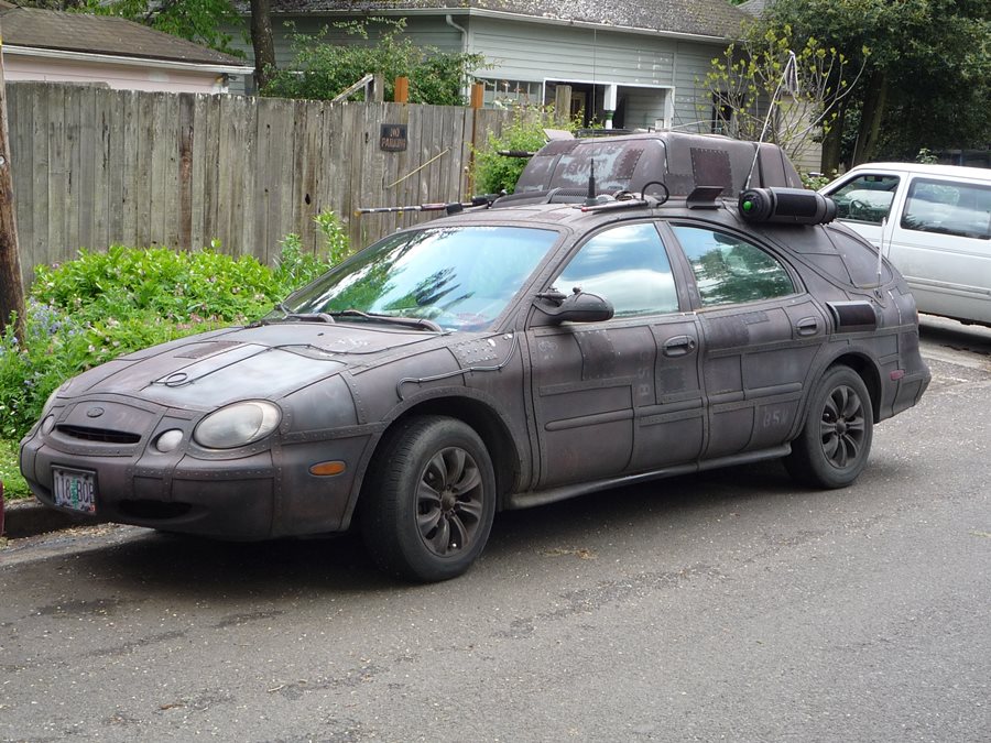
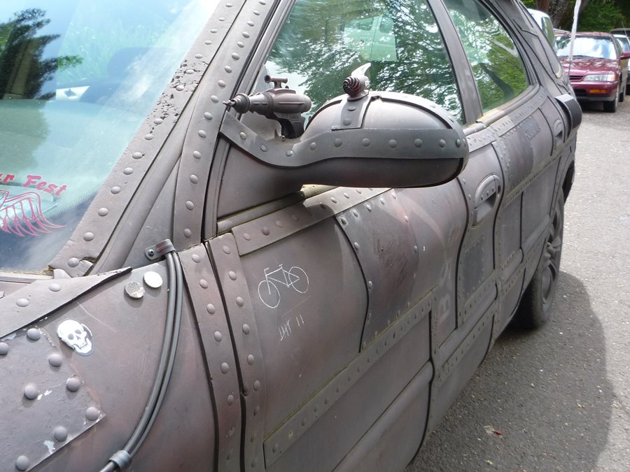
Ran into a friend of mine last night. He is an art car guy and was driving one of his older designs. It wasn't until a few hours later that I realized it was relevant to this thread


Perhaps this can give some other ideas. That steel strapping is actually self adhesive foam weatherstripping.
You'll need to log in to post.