As many have been following along on one of my threads I am starting my own business. Slow, nothing crazy. Still working out the little things but it's coming together rather quickly and the simple fact is I don't have a logo. I have a race car. I am offering oil analysis focused on amatuer racers and their cars. I need a logo.
So the company name is The Racer's Oil Analysis Resource, or The R.O.A.R. One of my friends (former boss from the place that taught me this stuff who helped push me to go for it) said she would be very disappointed if there wasn't a lion involved and I am inclined to agree. I have zero artistic skills. The wife doesn't know what to do with it. I want something simple that makes stickers easy (because stickers make you go fast). I'm a soul stealing ginger so the idea of a ginger lion is hilarious on many fronts but may not translate to others well.
With that I turn myself over to the powers that be here at GRM and ask for logo suggestions. If I choose yours I will throw in something... maybe a free kit. Maybe a free hug.
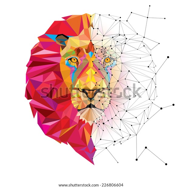
Company name with letters in a ring around one of these and your website address under the head

https://www.istockphoto.com/illustrations/lion-roar
No logo art on my end, but I'd like to see the letters subtly represented in the mane and ears.
R.O.A.R. we take pride in sharing knowledge and creating confidence and security in knowing that your engine is going to go the extra mile.
(Too long, but the pride/lion)
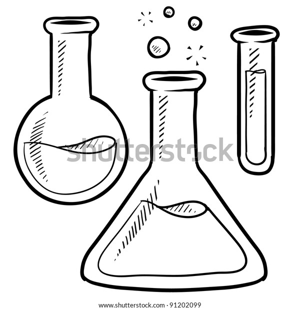
How about an empty triangle shaped flask with a lions head on it?
And company name under beaker. And absolutely do not use or alter this image. It is borrowed as an example only.

Motto as I have been thinking about it: ROAR, answering the questions you should be asking.
I would say what OHS posted, but with the hair parts of the image modified to look like oil drops. Or maybe a big oil drop with the lions head knocked out of it (white) to look like a reflection.
Some things to think of with logos: Simpler is generally better. How it will look with a background (black / white etc). Fewer colors is generally better.
captdownshift (Forum Supporter) said:
No logo art on my end, but I'd like to see the letters subtly represented in the mane and ears.
R.O.A.R. we take pride in sharing knowledge and creating confidence and security in knowing that your engine is going to go the extra mile.
(Too long, but the pride/lion)
No lion, you'll take pride in your ride.
I think it's a little too informal but I shared it anyway thinking someone might move the concept forward.
aircooled said:
I would say what OHS posted, but with the hair parts of the image modified to look like oil drops. Or maybe a big oil drop with the lions head knocked out of it (white) to look like a reflection.
Some things to think of with logos: Simpler is generally better. How it will look with a background (black / white etc). Fewer colors is generally better.
I like the oil drop idea. Or something with an oil change catch pan perhaps.
If you do an oil drop in the shape of a lion and there's sparkling gold flecks in it's mane, it's a bold move, but it literally speaks to the importance of the service.
I wouldn't hesitate to suggest as a motto, answering the questions that you weren't even aware that you should be asking.
To be honest, I like the lion ideas but they have nothing to do with oil analysis. If I just see the lion I probably think of the zoo, or jungle, or cat food. The best logos give you some idea of the product.
I have absolutely no artistic talent so I won't even try to draw what is in my head: a race car or just an engine with "Racer's Oil Analysis Resource" blowing out the exhaust. And the tag line "Don't just guess. Knowledge is Power."
I'll add, our host here are really amazing at this sort of work. It's literally what they do.
I would reach out to them for a consultation and to get a quote of what it would be to help on this project. And I know that this is not a charity or a non-profit endeavor, but I would be willing to chip in to assist in having their efforts on this project.
Yourself said:
To be honest, I like the lion ideas but they have nothing to do with oil analysis. If I just see the lion I probably think of the zoo, or jungle, or cat food. The best logos give you some idea of the product...
You also want logos to stand out and be memorable. E.g. what about a shell, a 76, or a Pegasus screams gas and oil? What about an apple says computer? Etc. But you know what they are, and you remember them. Sometimes the bigger the disconnect, the more memorable.
In reply to aircooled :
And that is why I became an engineer and did not go into marketing. 
But the examples you gave also had multi-million dollar advertising campaigns to make the connections and make them memorable. And there are indirect connections: shells remind me of fossils which makes me think of oil, Pegasus is a flying horse that reminds me of the transition from horse power to horsepower, and 76 ... well, no connection at all.
If he is looking for ideas, they are ideas. Hey, you get what you pay for. 
Yeah, he really should be happy we are even discussing it! 
Lets just say you can approach it from many directions and realistically as long as he likes it and it doesn't turn anybody off (or create confusion), it's good. It's not like a logo will make a company. It could certainly hurt it though.
oh my....

wait for it....

In reply to noddaz :
There's a "water pipe" company named ROOR, you'd run into copyright or trademark issues being that close in depiction.
I'm not an artist but I know an approach one could take...
Start with a well known, reputable, and popular company's logo, and just add italics and hope nobody notices:


Seems to work, eh Bob?
Honestly, I don't think the graphic image should be a lion. You are not selling lions, or selling anything to lions.
The graphic should focus on the "Roar"ing aspect of a race car engine.
It should be a race car, not a lion. That makes me sad because lions are really cool, but it's the right business decision.
How about a checkered flag racing logo? You could replace the car with a lion's head.


I spend from 9am to 8:30 pm driving home from Acworth, GA (sister's house) to home in Ohio, by myself. I gave this topic a lot of thought.
Initially, trying to work in a lion I had this inspiration

This would be a lion head flanked by two flags. The first flag (left) should be a checkered flag and the second flag could be the "oil on track" flag of red/yellow or the mechanical problem flag meatball.


I then seeked for some other Roar and found this:


Working on a rectangular version, I start with this logo we all know:

Racer's Oil Analysis Resource (in small letters where Grassroots is)
Then R.O.A.R. in large stylized font (where Motorsports is)
Replace "the hardcore..." with your tag line about "answers" or other suggestions of "the science of racing" or "the science of winning"
Maybe a background checkered flag like you see in the black/red logo above.
I agree some with Paul that incorporating the lion can be a challenge. I prefer somehow implying the roar of the engines more than the roar of the animal.
I have ideas (that confess that I am poor at explaining) but I completely lack the skills to do the actual artwork.
The oil on track flag and checkered flag sounds awesome.
Many things roar. Dinosaurs > lions.
Oil = dinosaurs.
WIn.
