The unfun update: Tesla software version 11 has rolled out. We got ours on Christmas Eve. It has a bunch of minor tweaks like how the battery is managed when you're pre-warming the interior and if the cruise control optionally makes a noise when activated.
There's one very visible and useful change. When you turn on the turn indicator, a portion of the center screen shows the feed from the blind spot camera on that side. It's pretty handy, as that camera has really good coverage of the area behind the mirror. Given that the car doesn't have stellar outward visibility due to a high rear beltline, it's a good addition.
But the rest, I am not happy. I've written before that I am not a fan of interfaces that change. The Tesla interface has been evolving slightly, but not radically. This v11 is more radical.
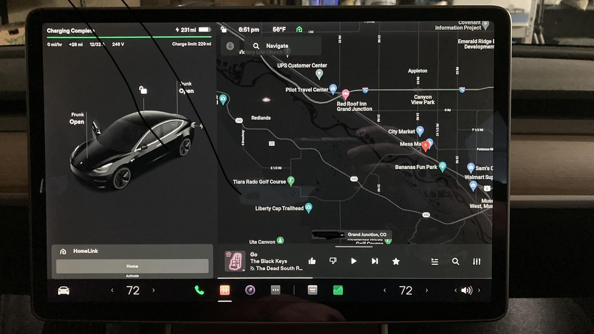
Some of it is cleaner. The gear indicator and the speedo have moved slightly. Some of the controls like the map zoom/up/traffic/satellite choices (not visible right now) and the primary temperature setting are closer to the driver which is a good idea. The HomeLink pop-up is a nice touch that only happens when you're at home and get in the car (you can also tap the Homelink icon at the top anytime, but that's a smaller target). There's a little more font consistency. There's been some definite consolidation of secondary controls like mirror adjustment, one tap to summon all of the on the same screen in big tiles, that looks like someone doing a reset on an interface that's been evolving.
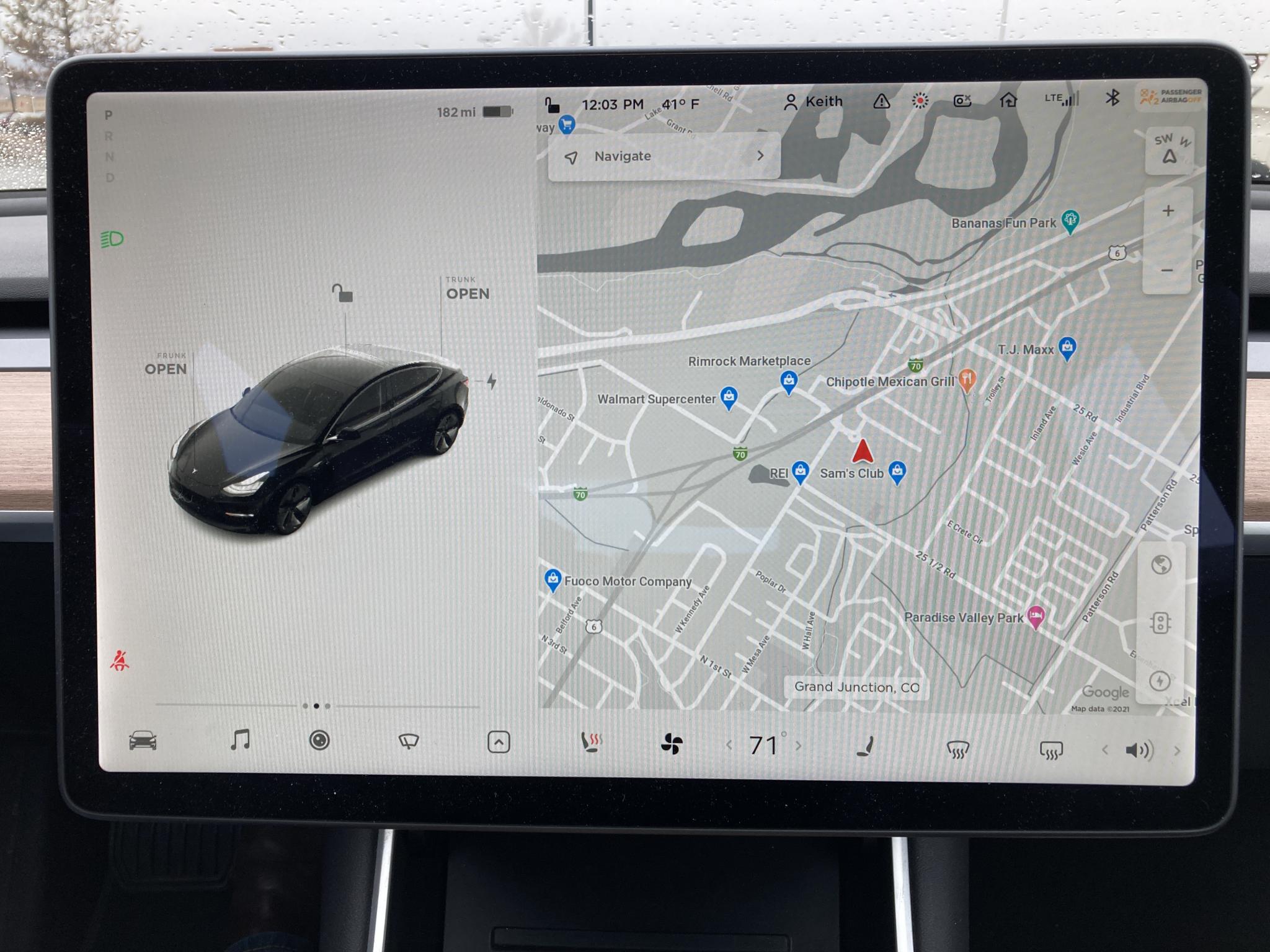
But the row of static icons along the bottom of the screen - the Tesla equivalent of the buttons that live on your center console - are mostly gone. Here's a reminder of what it used to look like - ignore the difference between day (grey) and night (black), that remains.
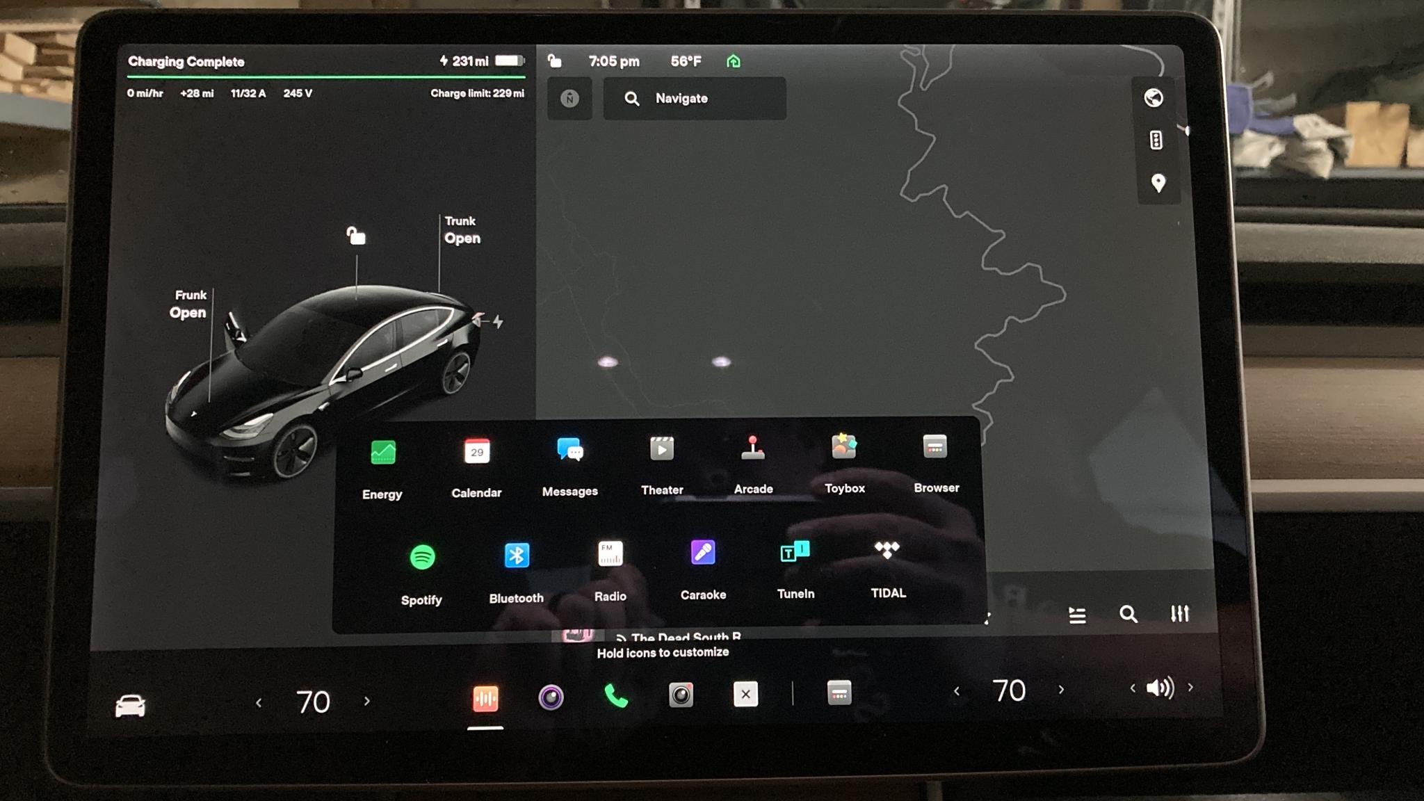
Those five colored icons at the bottom? Up to four of them are customizable so you can set your car up the way you like it. Not a great idea, but at least they stay the same. The remaining ones on the left are dynamic and show you most recently accessed functions. That's a TERRIBLE idea. Controls should do one thing and always one thing. You shouldn't have to look and see and interpret and decide. GM has made this same mistake with the Hummer, it has physical switches that change function depending on context and you can tell what they're going to do by looking at a label.
The customizable ones are set just like moving apps around on an iPhone - tap and hold, then drag. You have a choice of about a dozen and a half functions. The icons themselves are poorly designed - who thought an orange square with vertical lines was more clear than a pair of music notes for the sound system? Someone needs to fire the TikTok addled kids who did this interface design and let the adults back in the room.
BTW, the heated seats are now part of the HVAC controls, tap the temperature and you get the HVAC interface. The seats now have an "auto" setting so in theory you shouldn't have to access them, but Janel is the sort of person who sets a thermostat to 80* so the room will warm up faster, so she wants her seats on when she decides and not the car.
Here are the choices for those icons. You can summon this screen at any time by tapping the ... button beside the permanent icons, and close it by pressing the X. Note that the orange music icon will give you the music player with all sources including Tidal and TuneIn and Spotify and radio and whatever so those choices are just shortcuts. And yes, between this picture and the previous one I did change the selected permanent icons. Music, rear/side cameras, phone and dashcam player BTW. The dynamic one on the right is "browser".
I was afraid this would happen at some point. I'm not pleased about it.