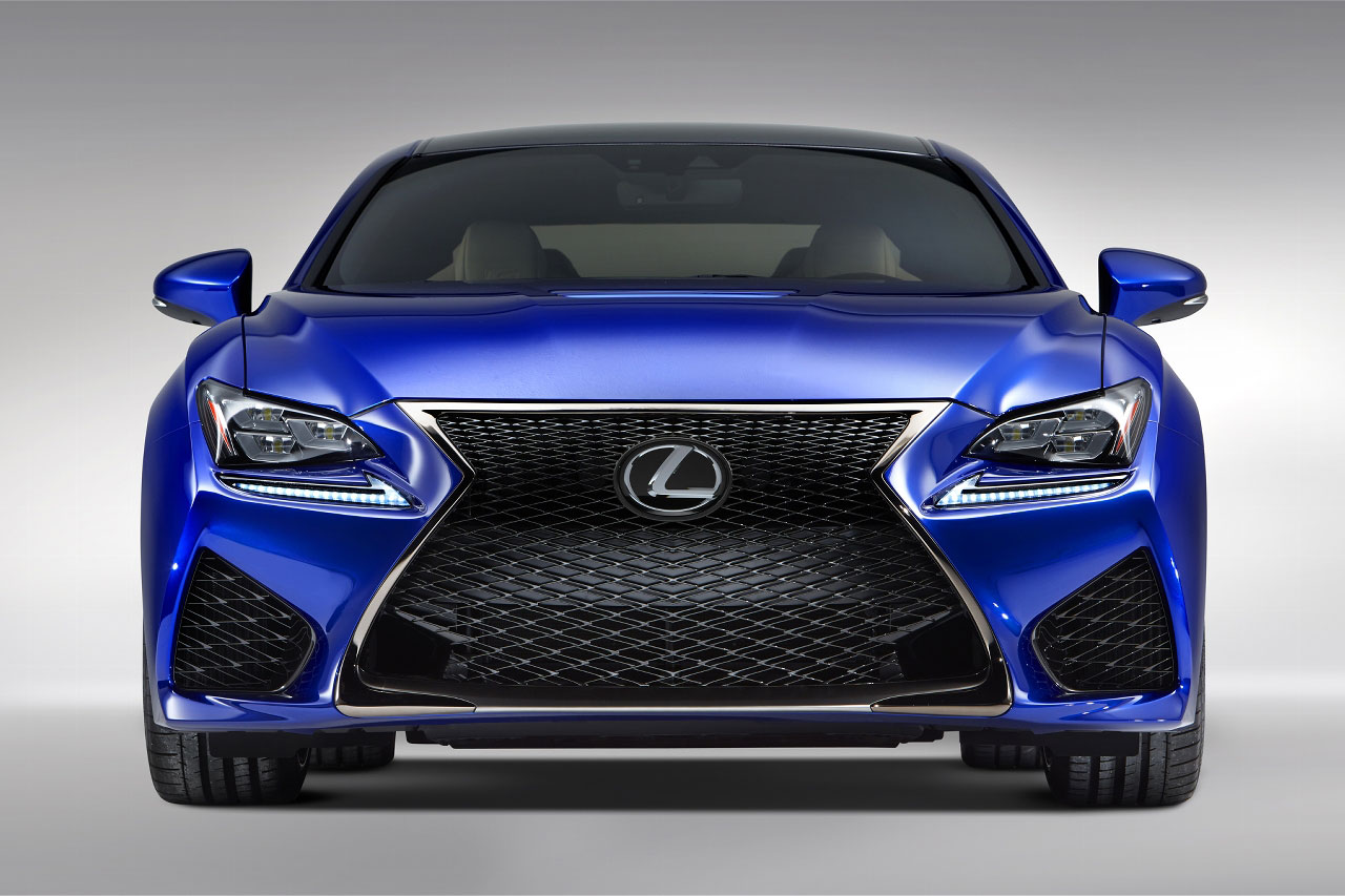
First, you come up with an interesting new design element that people seem to like; in this case, an hour-glass shaped grill:

Then your competition copies it:

So to stand out, you make it bigger:

And if a little bigger is good, then a lot bigger must be better:

And you're left with a grossly exaggerated monstrosity that no one will buy because it's ugly.
Anything worth doing is worth overdoing


Powar
SuperDork
8/21/14 2:21 p.m.
Every vehicle in this thread is ugly.

Duke
UltimaDork
8/21/14 2:21 p.m.
Isn't that pretty much how Japanese culture works? Except sometimes they skip step 1 and go straight to step 2.
It's known as the Cylon grill. The designers were rabid Battlestar Galatica fans. 
Don't forget the giant chrome Acura beak thing. Did that finally go away?

Matt B
SuperDork
8/21/14 2:30 p.m.
While I don't disagree with the premise of this thread, I still blame Audi for the "gaping hole in the front of the car" trend. I wish it would DIAF, but it seems to be holding strong. 
I kinda like it...better than boring crap

DrBoost
UltimaDork
8/21/14 2:42 p.m.
That is a nasty design trend. The first iteration is unattractive, then quickly turns butt-ugly.
Further proof that Toyota has forsaken Car People. The way I think about cars must be fundamentally different than anyone who would see appeal in this design language.
I wonder if there is actually some engineering need for all that.  Maybe for hybrid cooling needs?
But something tells me that there is some engineering sitting in the design room with the heavy breathers all nodding their heads at the mega grill while he is thinking, "WTF! I only need 600cm^2 of front opening to cool the whole car??
Advan046 wrote:
But something tells me that there is some engineering sitting in the design room with the heavy breathers all nodding their heads at the mega grill while he is thinking, "WTF! I only need 600cm^2 of front opening to cool the whole car??
This is EXACTLY what happens.
why am I reminded of the alien from the original predator?

Duke
UltimaDork
8/21/14 4:15 p.m.
In reply to JacktheRiffer:
Ugly but eye-catching is still ugly.

Duke
UltimaDork
8/21/14 4:19 p.m.
Flynlow wrote:
Advan046 wrote:
But something tells me that there is some engineering sitting in the design room with the heavy breathers all nodding their heads at the mega grill while he is thinking, "WTF! I only need 600cm^2 of front opening to cool the whole car??
This is EXACTLY what happens.
Which is exactly why I hate it. When you get close, you realize half of it is just blanked-off fake. It's as if half the windows on the front of your house were drywalled over on the inside. Stupid.
And then, there's butt ugly.
[URL=http://s937.photobucket.com/user/MichaelYount/media/juke_zps71eeb741.jpg.html] [/URL]
Powar wrote:
Every vehicle in this thread is ugly.
The Infiniti isn't horrible.
Maybe Lexus can call that model The Predator.
nderwater wrote:
Anything worth doing is worth overdoing

There are a few soccer moms in town with these monstrosities and yeah, uglier than sin. The old GX wasn't exactly the prettiest SUV but I could at least stand to look at it.
Feedyurhed said:
Powar wrote:
Every vehicle in this thread is ugly.
The Infiniti isn't horrible.
I agree, the Infinity G is not a bad looking car...wait, its not a G anymore, whatever the hell its called now, its good looking.
mazdeuce wrote:
Don't forget the giant chrome Acura beak thing. Did that finally go away?
I think Acura may have gone away. I haven't seen one in some time. I liked Japanese styling better when it was put of some very angular digital future.
Tyler H wrote:
Further proof that Toyota has forsaken Car People. The way I think about cars must be fundamentally different than anyone who would see appeal in this design language.
Didn't they just release a small car that's 100% about driving dynamics? And they have announced a new Supra too. Man you guys are hard to please. Guess the aftermarket exists for a reason!

DrBoost
UltimaDork
8/21/14 5:25 p.m.
MichaelYount wrote:
And then, there's butt ugly.
[URL=http://s937.photobucket.com/user/MichaelYount/media/juke_zps71eeb741.jpg.html] [/URL]
While I agree that this is ugly, at least most, if not all of the odd styling elements have a specific purpose (improved aero).


 [/URL]


