DrBoost wrote: While I agree that this is ugly, at least most, if not all of the odd styling elements have a specific purpose (improved aero).
Do you really believe that?
DrBoost wrote: While I agree that this is ugly, at least most, if not all of the odd styling elements have a specific purpose (improved aero).
Do you really believe that?
I'll buy that line for the lumpy headlights (punch a hole for the side mirrors), but otherwise... not so much.
LOL - yeah, the Juke is renowned for its improved aero. I'm sure that's what the District 9 critter had in mind when it impregnated that Pontiac Aztek.
Can we just sticky 5 threads to take care of this E36 M3.
1. How ugly new cars are.
2. How heavy new cars are.
3. How expensive new cars are.
4. How bad Honda/acura is.
5. How out of touch Toyota is.
mr2peak wrote:Tyler H wrote: Further proof that Toyota has forsaken Car People. The way I think about cars must be fundamentally different than anyone who would see appeal in this design language.Didn't they just release a small car that's 100% about driving dynamics? And they have announced a new Supra too. Man you guys are hard to please. Guess the aftermarket exists for a reason!
I've paid my respects at the shrine of Toyota's sports cars..I've owned a fleet of MR2s alone. The Scion is cool and we'll see what happens when the Supra comes out. I still think it is hard to point at another manufacturer's lineup that is as devoid of interesting cars. And it is apparently great for business.
But back to the matter at hand:
Who put up concept art in front of a design board...of car professionals...and got positive feedback on this design language? Groupthink at its worst. If you have to struggle to come up with some practical explanation to defend it, it doesnt work. Here's mine: Maybe it's a way to break up the taller front ends necessary for new commuter impact standards?
I heard / read an article somewhere that audi started this trend to meet strict European pedestrian safety standards.
Maybe that is why the Japanese companies are copying the trend.
I think they look like E36 M3.
nocones wrote: Can we just sticky 5 threads to take care of this E36 M3. 1. How ugly new cars are. 2. How heavy new cars are. 3. How expensive new cars are. 4. How bad Honda/acura is. 5. How out of touch Toyota is.
Yes that's perfect but don't forget:
I work for a Japanese company that make styling components (exterior vehicle lighting) and all I can say is that they basically just make E36 M3 up as they go, change it often and provide little information. Then magically one day everything is complete and they use shapes/images/things from real life that transpire into designs for lighting.
pretty wild and pretty frustrating.
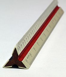
I love 80's Japanese cars but I think this was the only tool the designers could afford:

wvumtnbkr wrote: Also... The 80s were awesome. Especially 80s wheels.
I must be outta my mind but still like this design language:
[URL=http://s265.photobucket.com/user/derekrichardson/media/Mobile%20Uploads/image-52.jpg.html] [/URL]
Pedestrian impact is a big part of why cars seem to be getting stocky. They have to get puffy and softer to pedestrians but the car companies don't want to sell soft. So if it must be bigger then it might as well look more like the predator than a teddy bear.
What is more frustrating, given the mega grills, is that they have all this area to DESIGN in a great front licence plate installation but choose to continue to have the add on bracket that just has it hanging out there to break up the aero and look of the car. Why not take some of that blanked off fake cooling grill and design in a proper licence plate location. I do not like front plates but it is a reality of laws.
Trans_Maro wrote: I love 80's Japanese cars but I think this was the only tool the designers could afford: wvumtnbkr wrote: Also... The 80s were awesome. Especially 80s wheels.
Hey I resemble that comment!! My new van had to have been developed using that tool. Heck the cross section of the ruler is a diamond star!
As much as I can't stand these over-sized and over-styled fake grill 'openings' with black plastic covering the majority of it, I do have to admit that the cars would probably end up looking even worse with those same tall front fascias but with the minimum amount of opening necessary...Unless you guys would rather the designers start taking their stylistic inspiration from Beluga whales.
Driven5 wrote: ...Unless you guys would rather the designers start taking their stylistic inspiration from Beluga whales.
Too late:
In reply to stanger_missle:
Indeed it is too late.
[URL=http://s265.photobucket.com/user/derekrichardson/media/Mobile%20Uploads/image-53.jpg.html] [/URL]
You'll need to log in to post.