I generally concur with codrus' assessment, especially on the composition. Personally, I'd be trying to get as much of the green field (meadow? hillside?) in the frame behind the car to create visual interest due to the similarity of color. A larger aperture setting would blur the background somewhat, giving the best of both worlds (i.e., having a useful background but still creating visual separation between it and the main subject).
200mm is longer than I normally use with static cars (I have a 200/4 that I've done some on-track shooting with). I've generally used focal lengths between 50 (my preferred normal length, one I'm very comfortable with) and 100. I recently got an 85/2 that has lovely rendering - I'm planning to take it along the next time I'm shooting cars. I agree that wides really don't help the situation - not only do they distort and alter perspective, but they make it harder to separate the foreground and background. The current fetish for ultra-wide lenses is not one for which I have much use.
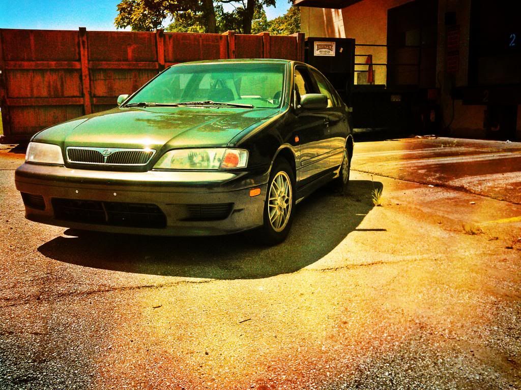
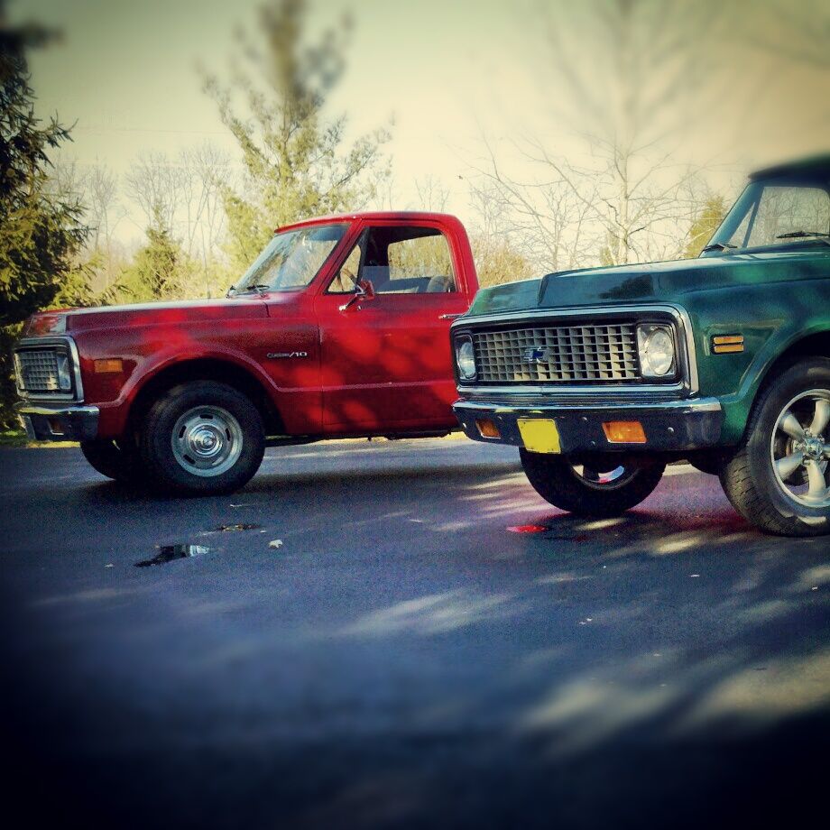
If you like the heavily filtered look, then there are certainly plenty of options (it's not to my taste, but that's the subjectivity I said I wouldn't comment on). The (objective) issue I have with the look is that a technology that was intended to make photographs look distinctive ironically ends up making them look very much alike as people apply the same filters time and again.

codrus wrote:
TurboFocus wrote:
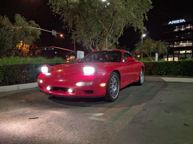
how'd i do?

I like the angle of the car, and you're down low, which is good (a lot of people shoot cars from eye level, which looks terrible). I also like the way the brick lines all point at the car.
The side of the car needs more light on it, IMHO. From the looks of the sky, the sun has just set -- 15 minutes earlier would've been better. Compositionally I'd probably change the angle to take the brown building out of the shot, although that loses the brick lines. Perhaps you could move it closer to the fence on the right of the frame to eliminate the building?
Also, this is very much a style thing, but personally I'm a fan of longer lenses for cars. If you back up and zoom in so the car still fills the frame it alters the perspective, making it so that the back of the car doesn't look small compared to the front. This is hard to do with a cell phone, but on an SLR I like to shoot cars at 200mm or longer (in 35mm equivalent terms). It's the difference between a shot like this:
 And like this:

That's cheating! You can't take a bad picture of an FD--- that's like finding an ugly picture of Heidi Klum 
So you're saying my car is ugly :(
TurboFocus wrote:
So you're saying my car is ugly :(
Not at all! That's a cool little machine. I also agree with codrus's tips on improving your (already good) photo.

jere
HalfDork
6/16/17 10:32 a.m.
There is another rule that may or may not apply for cars. The grid, which is basically imagining there is a tic tac toe grid in your viewfinder. Then getting the subject where the lines cross.
Like this sort of
In addition to the golden hours I like cloudy days. My cameras have all been junky or old. It really helps with colors and gets rid of shadows.
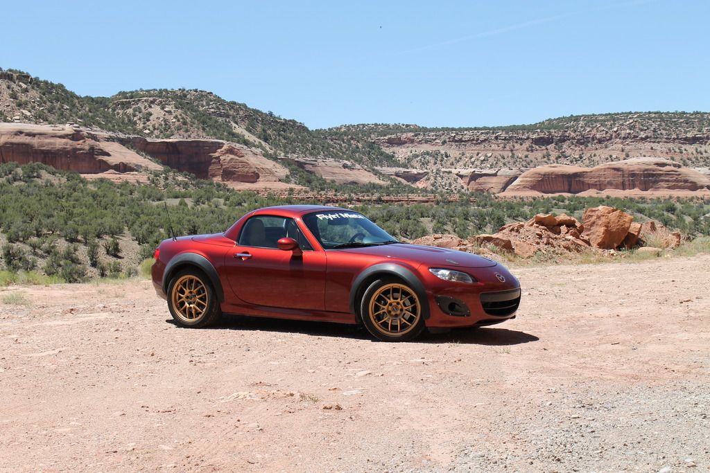
Well, Here is my way too quick attempt of a pretty photo of the new car. The sun was out full blast so I couldn't get the glare off it. I did find it looked kind of like a natural there.

-Back up and zoom in to eliminate perspective distortion
-Shoot during sunrise/sunset for more even lighting and less glare
-Use a tripod to shoot 2 photos with different exposures, combine later in Photoshop. This eliminates the problem of washed out/too dark areas.
-Use the proper ISO & white balance for the lighting.
bmw88rider wrote:
Well, Here is my way too quick attempt of a pretty photo of the new car. The sun was out full blast so I couldn't get the glare off it. I did find it looked kind of like a natural there.

Nice car. I think the shot would benefit from some cropping - primarily of the bottom and left side, to put the car firmly in the lower left quadrant - and a curve adjustment to darken it a bit while preserving the highlights. You could shoot with a longer lens and a wide aperture to compress space and blur the background a little if you wanted more attention directed to the car, but the background is not obtrusive even fully in focus.
02Pilot wrote:
bmw88rider wrote:
Well, Here is my way too quick attempt of a pretty photo of the new car. The sun was out full blast so I couldn't get the glare off it. I did find it looked kind of like a natural there.

Nice car. I think the shot would benefit from some cropping - primarily of the bottom and left side, to put the car firmly in the lower left quadrant - and a curve adjustment to darken it a bit while preserving the highlights. You could shoot with a longer lens and a wide aperture to compress space and blur the background a little if you wanted more attention directed to the car, but the background is not obtrusive even fully in focus.
The original actually captures the look of the area pretty well mid-day. It's a merciless sun with a lot of contrast. bmw88rider did pretty well to get as much light on the side of the car as he did.
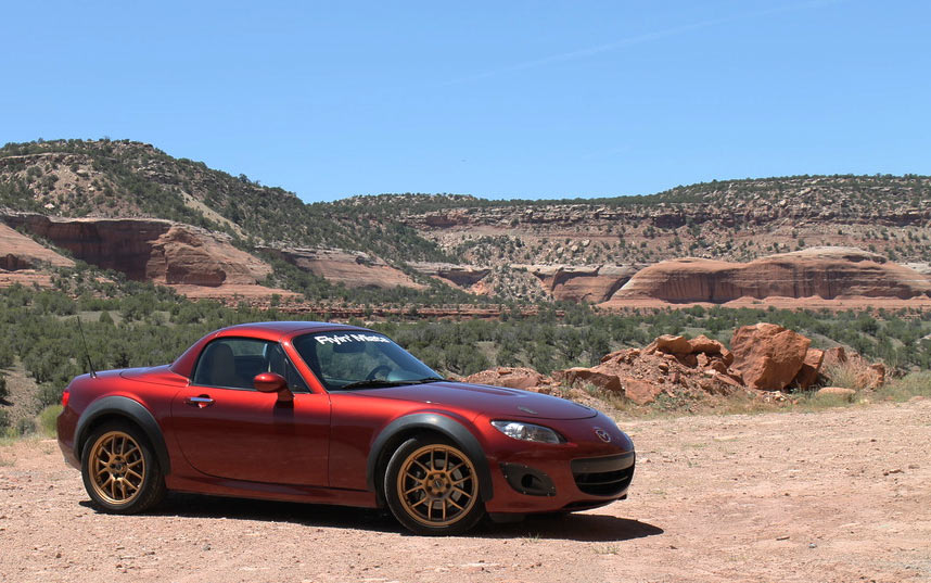
Tweaked.

Keith Tanner wrote:
02Pilot wrote:
bmw88rider wrote:
Well, Here is my way too quick attempt of a pretty photo of the new car. The sun was out full blast so I couldn't get the glare off it. I did find it looked kind of like a natural there.

Nice car. I think the shot would benefit from some cropping - primarily of the bottom and left side, to put the car firmly in the lower left quadrant - and a curve adjustment to darken it a bit while preserving the highlights. You could shoot with a longer lens and a wide aperture to compress space and blur the background a little if you wanted more attention directed to the car, but the background is not obtrusive even fully in focus.
The original actually captures the look of the area pretty well mid-day. It's a merciless sun with a lot of contrast. bmw88rider did pretty well to get as much light on the side of the car as he did.
Tweaked.

Agreed - the shadow area has a lot of information in it. Your edit is pretty much what I had in mind.
Yeah, pretty cool what the simple rule of thirds can do for composition.


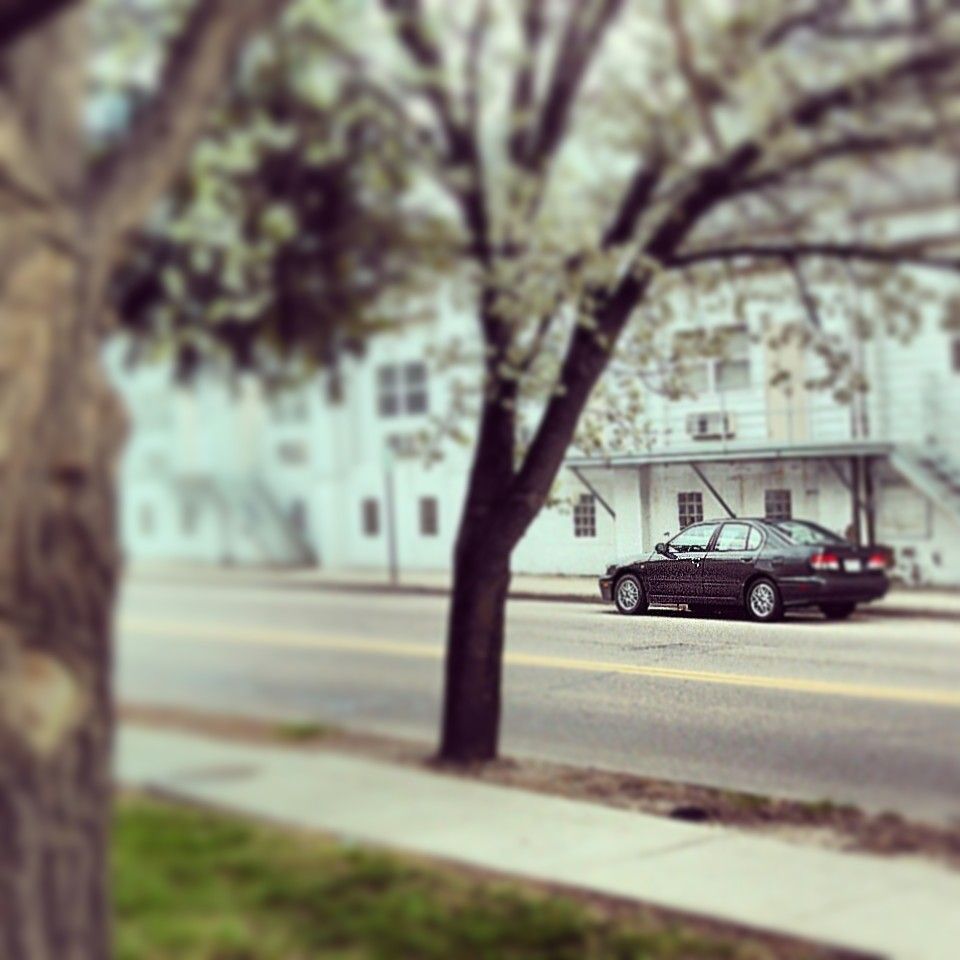


 And like this:


