Who's got a good collection? I need a good picture or scan of a specific Auto-X/GRM logo from the early 90s. JG doesn't have one and he's all tied up with the Rolex, so I turn to you. I want to turn it into a vector logo for a project and then I'll pass that along to JG so he has a copy. In short, you'll be benefiting everyone!
Here's the logo. A scan would be ideal, but even a straight on cellphone shot would give me something to work with. I don't think I have anything quite that far back.
Anyone? This picture is close, but the better I start with the better the end result.

^I could turn that into a good vector graphic, if you don't find anything better. It would be a lot of work though. I'd start by straightening out the bending of the magazine in the photo.
Which is exactly why I'm asking if anyone can provide a cleaner image to start with. I can vectorize it, but the less repair I have to do the better.
Plus it's really fun to look at these old covers. Here are a couple I found on eBay. The last one isn't a bad shot of the logo.


I can scan that issue, Keith. I know I have it, just need to dig it out and be sure it's in good shape. Gimme an hour , or so.
Awesome, thanks. It doesn't have to be any specific issue, just one that has the combined GRM/Autox logo on it like the ones above.
Damn that's a sweet C4. I wish I had a copy so I could check out that article!
In reply to Keith Tanner :
Where do I email it to?
Pete Gossett said:
Damn that's a sweet C4. I wish I had a copy so I could check out that article!
It's on eBay right now, you could make it yours!
DeadSkunk is my favorite GRMer.
I should have a copy since I wrote the Pikes Peak article in that issue and I usually kept those issues in my files, but I can't find it right now. I might have just saved the article. If you still need a copy of the cover, let me know. I'll keep looking.
Now that is what I call a great community! Less than two hours from request to email with a scan, impressive.
Ottawa said:
Now that is what I call a great community! Less than two hours from request to email with a scan, impressive.
....and I took an hour for lunch before I did it. 
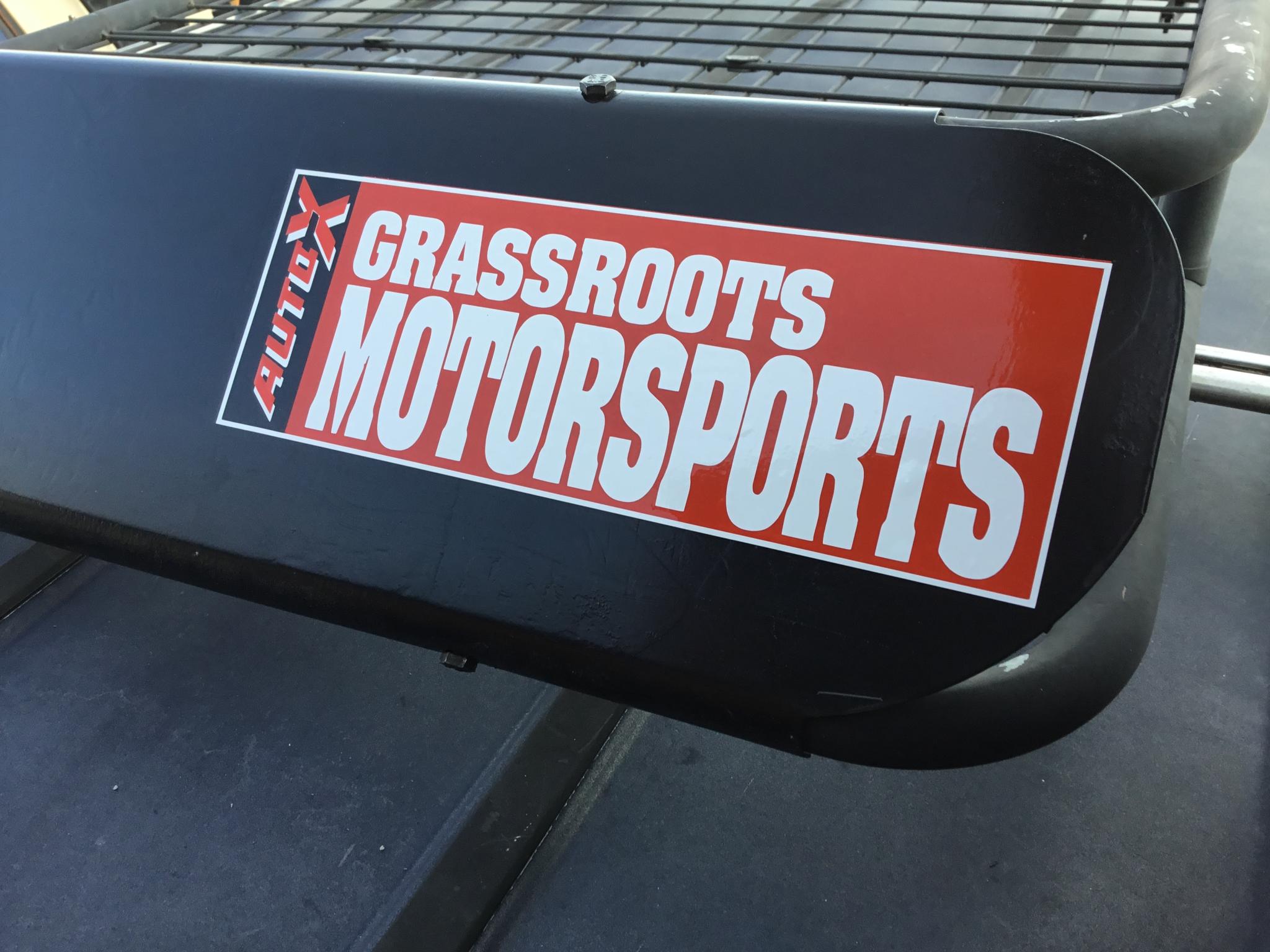
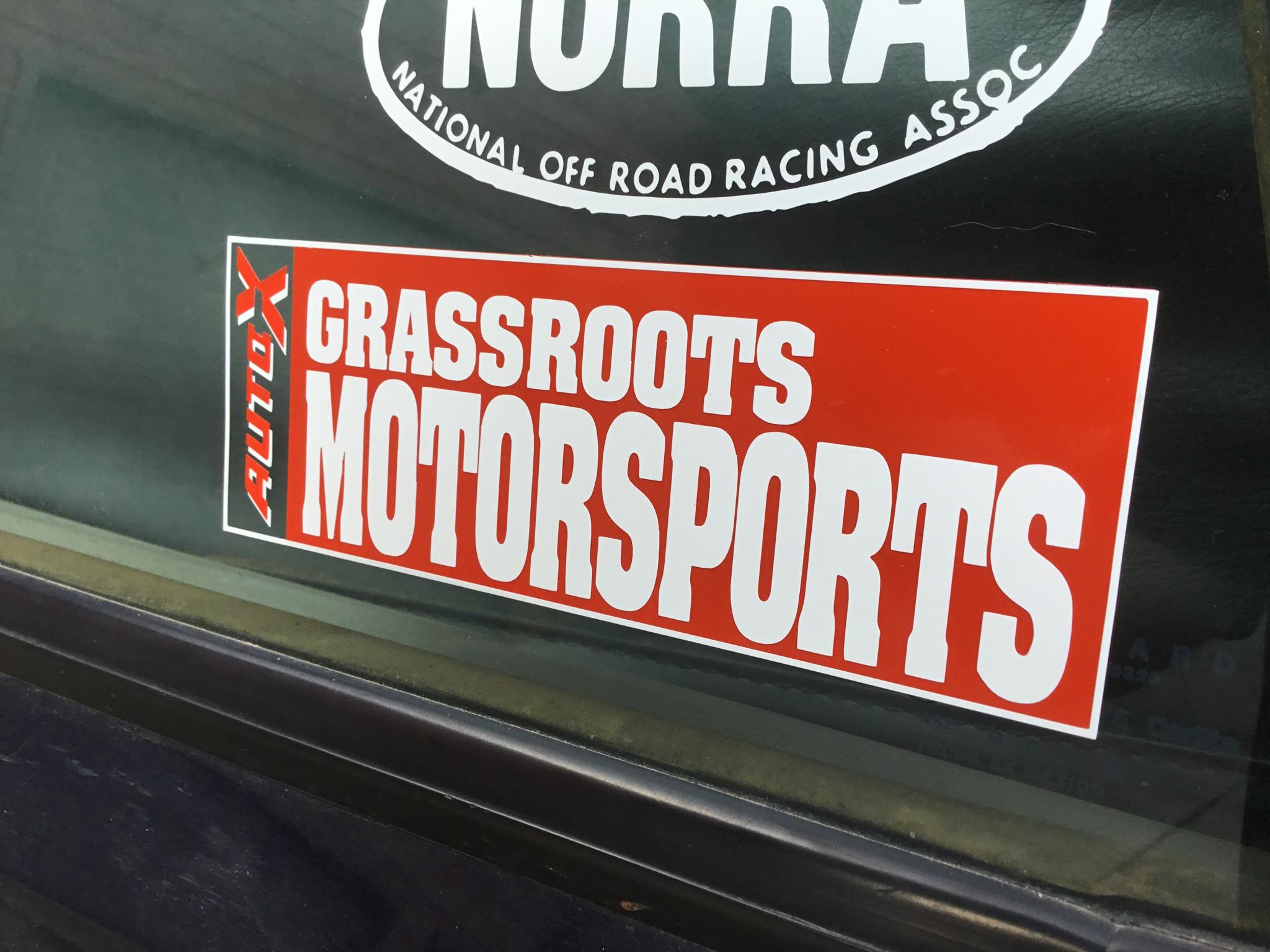
Took me a bit longer, but here's a nice clean vector version of the logo.

If you were going to print a batch I would like one as well
Ohhh if those stickers go public I would like a couple three or four.
Application is a three step process - the big red, the white, the Auto-x. On the glass, I should have done a black base layer too.
I've sent a copy of the vector version to JG for his records. I'll check with JG to make sure he's cool with me sharing the vector design at minimum.

Keith Tanner said:
Application is a three step process - the big red, the white, the Auto-x. On the glass, I should have done a black base layer too.
I've sent a copy of the vector version to JG for his records. I'll check with JG to make sure he's cool with me sharing the vector design at minimum.
You beat me to it. Finally just sat down to scan the best issue I managed to dig up at the office yesterday. Thanks for saving me the trouble, and sorry I couldn't round it up sooner. Our archive copies at the office all seem to have a lot of wear in the "grab area" where they get taken out of the boxes, which is right over the logo.
Feel free to share it. If it's going to be out there at least it's a good version :)
I guess if I wanted to be picky and make a request it's that if anyone does use this logo, try and use it in the proper context. It would look great on a 1985 CRX Si or an NA miata, but I don't think it's appropriate on an FRS. That's just me, though. If someone wants to a complete period-correct CRX with that GRM logo and the Yokohama logo with the stars and a Koni triangle that would be incredibly awesome. We've actually kicked around the idea of doing a retro project car before. If the right candidate comes along it may happen sometime.
Awesome JG, thank you.
For those who want it - http://www.slowcarfast.com/misc/1991GRM.zip. That includes a full Illustrator version of the logo plus EPS versions of the white and red vinyl cuts that will give you the slightly simplified version. Pay attention when you assemble it, sometimes it's red on white and sometimes it's white on red.
Btw, it’s pretty fun to compare this old logo to the current one. It’s completely changed but looks the same. The only real commonality is the fact that it’s a condensed bold font. The font has changed to a sans serif, it’s now mixed case, the relative sizes of the words have changed, etc. But somehow, it’s related. Well done, guys.
The old Auto-x logo was done by hand and I have my suspicions about the other lettering as well. It’s also interesting looking at how fast it was changing in 1991, check out the cover pics above. The logo is different on every one, and it continued to evolve pretty fast.


