http://www.motorcities.com/vehicle/09IAB324921157.html

I think it looks like that 2-door Lexus that I recently read about here.
I don't dig it. It looks like some big-mouthed wise-ass kid who's pulled his eyelids back to pretend he's Asian.
It also looks like they borrowed the "smiling idiot" grille design from Mazda, which never fails to elicit snickers from me whenever I see one. Then again, I thought Audi's "big mouth" grille was dumb, too, and they seem to becoming pervasive, so what do I know...
It looks like a Audi TT and Mistu Eclipse ran into each other.
I like the 205 GTi personally. That's a hot Peugeot in my (strange) mind.
In reply to procainestart:
I think Mazda stole the huge grin from Peugeot like the 207 and 308 and...
looks like a large footprint car with little useable space and an ugly "triple bubble" shape to the front end. domed hood, domed headlights, weird dome above the grille area... ugh.
Carson wrote: In reply to procainestart: I think Mazda stole the huge grin from Peugeot like the 207 and 308 and...
Interesting. And too bad for both marques (IMHO...). ![]()
Carson wrote: The first time I saw a new Mazda3 I did a double take because I could've sworn it was a Peugeot.
That is exactly what I thought! We were in Turkey last year and saw lots of Peugeots and as soon as I saw the Mazda 3 my first thought was "who imported that Peugeot", then I saw the emblem.
Carson wrote: It looks like a Audi TT and Mistu Eclipse ran into each other. I like the 205 GTi personally. That's a hot Peugeot in my (strange) mind.
^^this (both comments)
Keith wrote: Uhh, not so much. They've got really nice lines, almost Ferrari-like. It's a Pininfarina design.
Yeah youre right, I was wrong, no GTO for the rear-Its late 90's corolla all the way! ![]()
I stick by the Cosmo front end.![]()
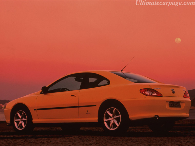
Those pictures illustrate the difference between a so-so design and a good one. Look at the details. The Corolla rear lights are large and don't really complement the rest of the car at all. They're just a random shape stuck on the car. The 406 tails echo the overall shape of the car, lifting angles from the greenhouse. They're integrated into the shut line for the trunklid. Meanwhile, a little bit of extra definition to the details in the bumper makes it look designed instead of accidental.
At the front, the lights are slightly tapered to add a bit of movement to the car and to echo the Peugeot lion face. They're far more dynamic, and they're one piece. You can't see it well on that black picture, but the grille opening is a narrower slot. Meanwhile, on the Cosmo, the lights were designed with a ruler with no flow. They have a seam that accentuates the shut line for the hood. There's a half-hearted attempt to use the upper half of the bumper to accentuate the lines of the lights, but it's clumsy.
Heck, just look at how the shut lines were treated on all three cars.
John Brown wrote: http://www.motorcities.com/vehicle/09IAB324921157.html
I understand that BMW thought it had nowhere to go since cars like the e39 represented the happy conclusion of decades long iterations of design ideas. Bangle rightly stirred the pot, and everyone is still reacting, but I very much dislike the notion that a car needs to be anthropomorphized, or needs to look like a bird or lion. I find the whole direction unbelievably trite. A berkeleying smiley face for a fascia? No thanks.
A honest machine has its own personality, designers should find out what that personality is and bring it forward.
Except for the fact that it looks like it is sticking its tounge out I like it. I am sure the aftermarket will come up with something to fix the front.
You'll need to log in to post.